This webpage contains supplemental online information for a W4A article under review.
This file is the dataset. This comma-separated-values file contains DHH participants' rating of the importance of each content region, across different layouts of 6 genres. This file contains participants’ encoded ID which has been defined in Demographics.csv. 6 columns of this file describe participants’ encoded ID, name of genres, name of layouts, Specific name of the Content Region used by wireframe, Content Region and importance score provided by participants. Among these columns, “Specific name of the Content Region used by wireframe” columns contains the simplified content naming we used during the experiment for participants’ flexibility or usability. The next column titled “Content Region” contains the standard content name which we have used across the paper. More specifically, the name of some of the content regions varies across different TV program genres which leads us to define a composite content region name. On the other hand, each row defines participants’ individual response of one content in a layout of a specific genre. In this way, this file contains 3002 sets(or rows) of DHH users’ content preference rating for 29 content regions from14 layouts spanning 6 genres.
This comma separated file contains participants’ demographic information from the importance-judgement study (section 5 of the paper). In this file, our 19 participants are referred to as P1, P2, P3, etc. This file includes participants’ gender, age, ASL skill, electronic device usage, and some other data collected during this study.
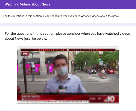
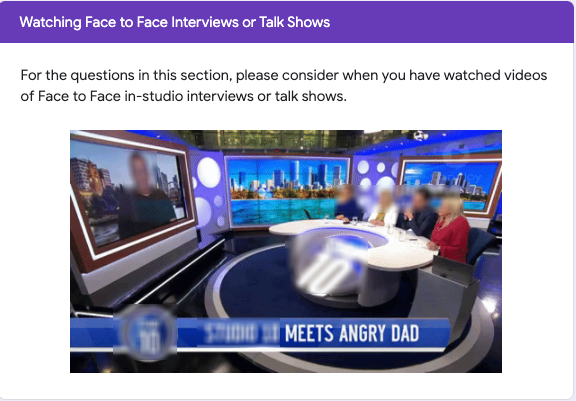
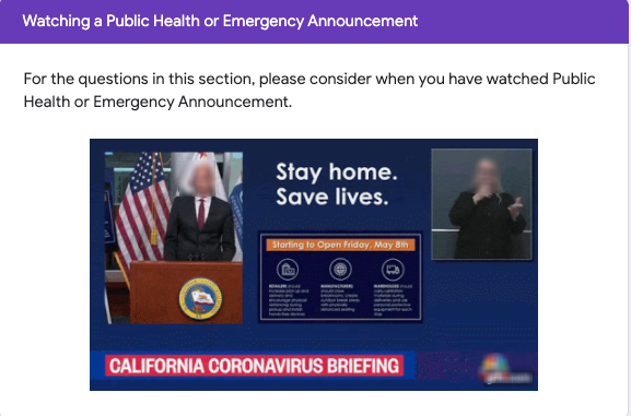
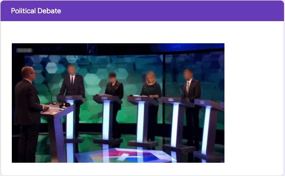
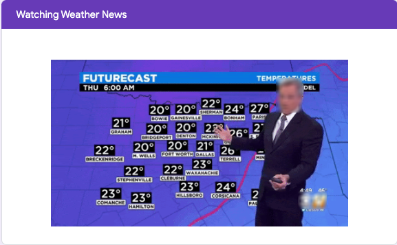
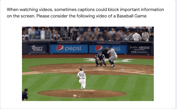
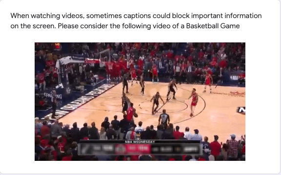
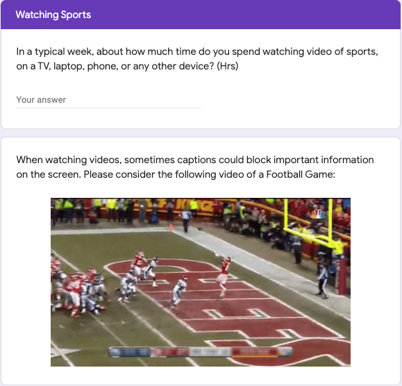
In the table below, we have shared 8 screenshots from our questionnaire used in this importance-judgement collection study described in section 5 of our paper. These images depict how stimuli were displayed to participants before they responded to the scalar questions. Screenshots with some obscured elements are provided here, as the authors do not possess copyright permission to directly redistribute the original video materials.
| File Name | Genre | Visual Description |
|---|---|---|
| 1.png | News | A News video stimulus in which a reporter is reporting from remote place. |
| 2.png | Interview/Talk Show | A hybrid remote and in-studio interview/talk show video in which some participants are in the studio and some are connected over the video-conferencing site. |
| 3.png | Emergency Announcement | A COVID-19 related emergency announcement consisting of one official announcing an emergency declaration, in the presence of an ASL interpreter. |
| 4.png | Political Debate | A political debate video stimulus, in which multiple politicians participated. |
| 5.png | Weather News | A Weather news report video stimulus, in which a presenter was explaining the weather report. |
| 6.png | Sports(MLB) | A Major League Baseball video stimulus, in which a pitcher is pitching the baseball towards the batter. |
| 7.png | Sports(NBA) | A video stimulus from an NBA basketball game, in which one team is attempting to score and another team is defending. |
| 8.png | Sports(NFL) | A National Football League video stimulus, in which the quarterback has thrown the ball. |
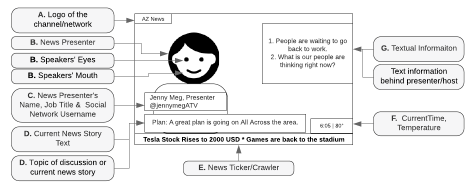
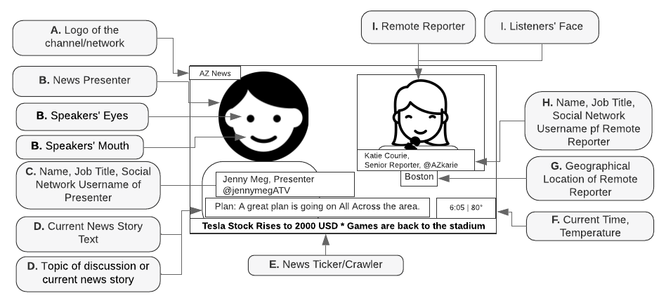
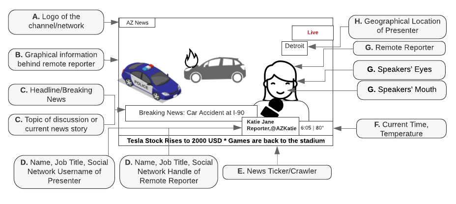
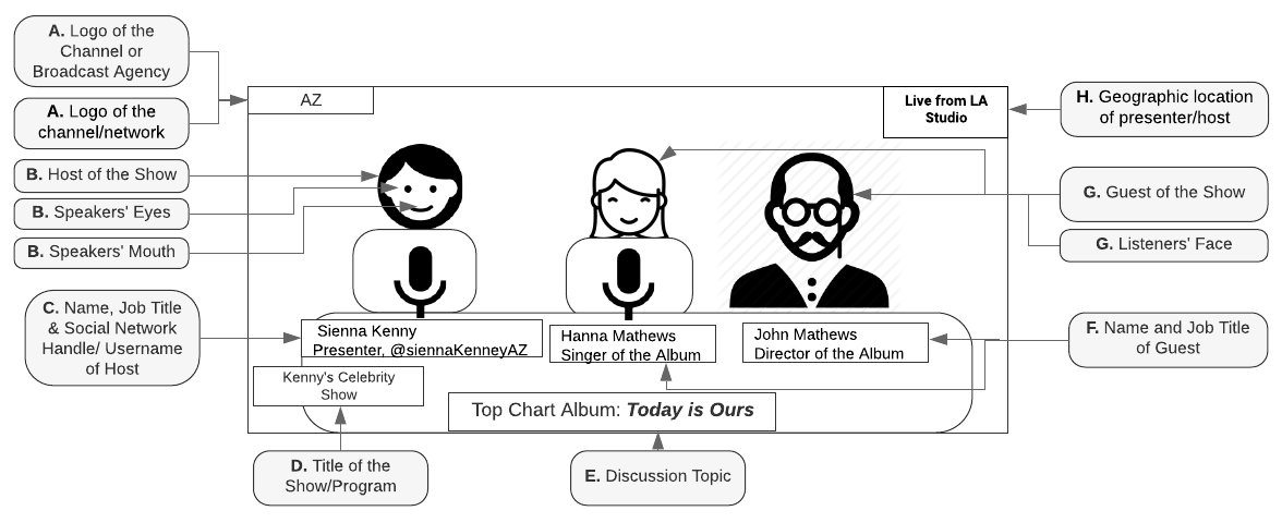
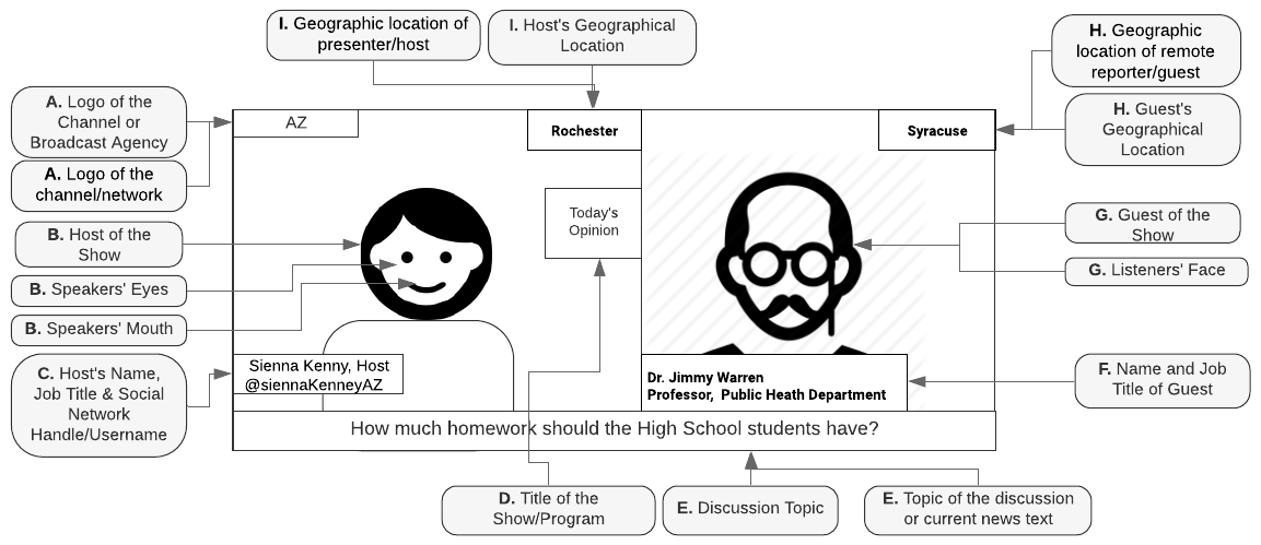
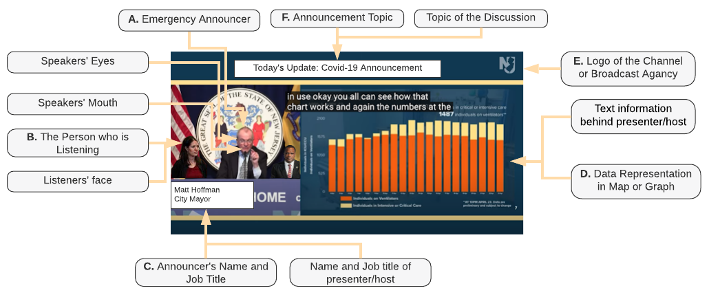
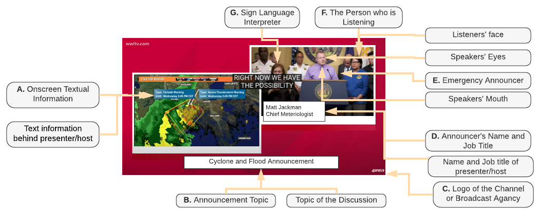
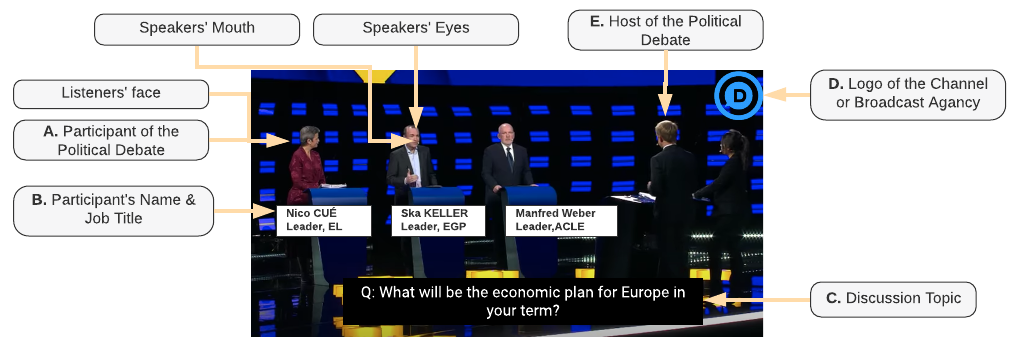
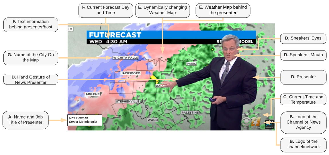
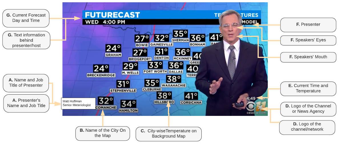
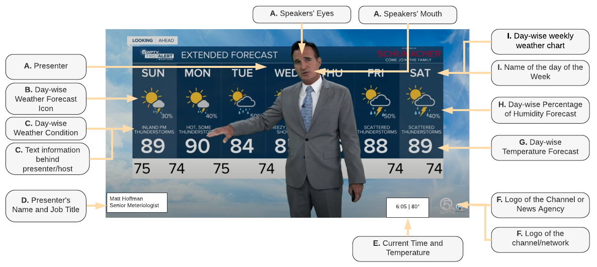
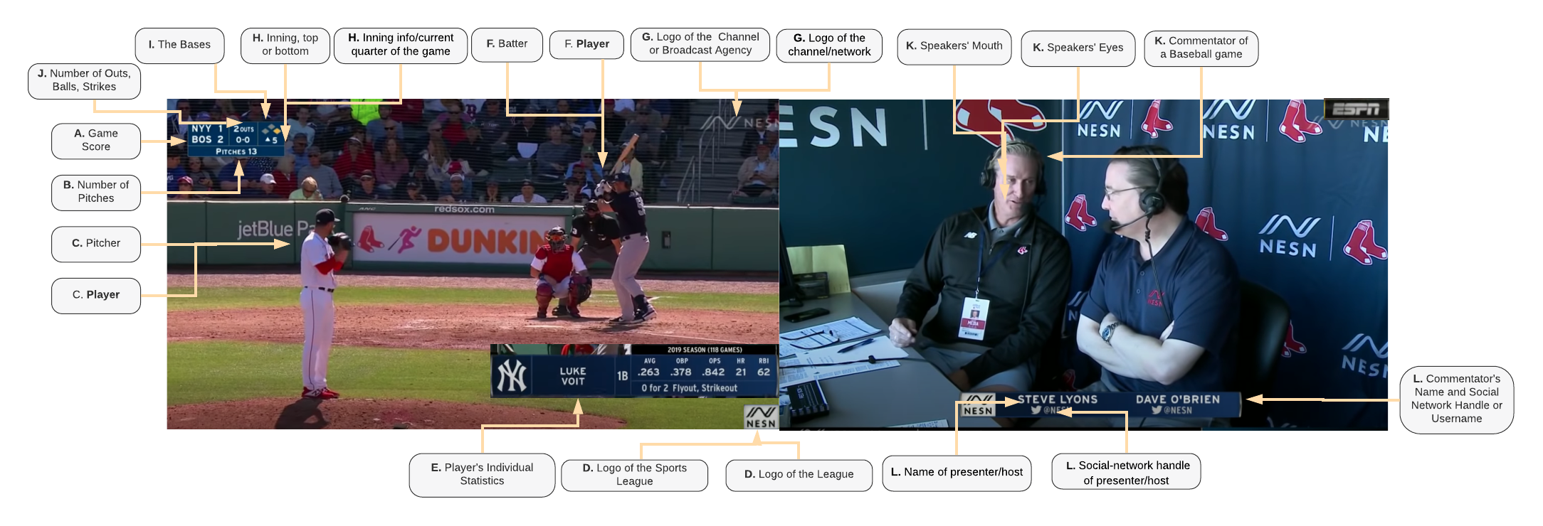
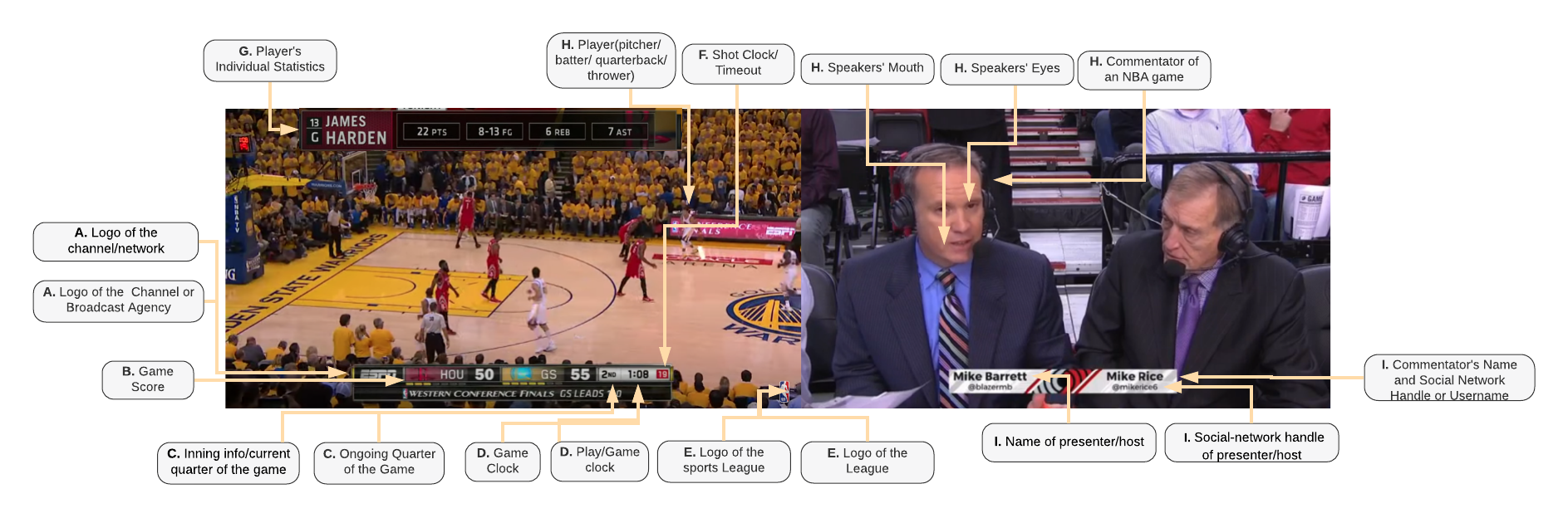
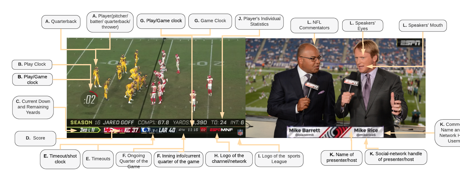
In this table below, we have shared a total of 14 diagrams spanning 6 genres, which we used during our importance-judgement collection study (section 5 of the paper) to collect DHH users’ responses about various onscreen content regions. The purpose of each diagram was to simply serve as a key or legend, to explain what region of the screen was being referred to when phrases such as "name of presenter/host" was used in a scalar question. Each diagram represents a specific layout, except for the sports genre, in which a composite is shown with 2 sub-layouts each, in which we represent a camera-view displaying commentators and the players separately. The table enumerates all the diagrams sequentially, along with information about which genre is associated with each.
| File Name | Layout | Genre |
|---|---|---|
| 1.png | Only the presenter/host is onscreen | News |
| 2.png | Discussion between news presenters and reporter | News |
| 3.png | Reporter is reporting live from the place of incident | News |
| 4.png | In-studio interview | Interviews or Talk Shows |
| 5.png | Remote interview | Interviews or Talk Shows |
| 6.png | ASL interpreter present onscreen | Emergency Announcement |
| 7.png | ASL interpreter not present onscreen | Emergency Announcement |
| 8.png | Several candidates visible onscreen | Political Debate |
| 9.png | Hourly weather forecast chart | Weather News |
| 10.png | Map view weather forecast | Weather News |
| 11.png | Weekly weather forecast chart | Weather News |
| 12.png | Commentators and game play of Major League Baseball (MLB) | Sports |
| 13.png | Commentators and game play of National Basketball Association (NBA) | Sports |
| 14.png | Commentators and game play of National Football League (NFL) | Sports |
This comma separated file contains participants’ demographic information from the metric-evaluation study (section 7 of the paper). In this file, our 23 participants are referred to as D1, D2, D3, etc. This file includes participants’ gender, age, ASL skill, electronic device usage, and some other data collected during this study.